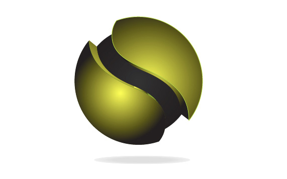
The circle epitomizes symmetry, amenable to bisection from every angle. I wanted to create a logo that projects symmetry with a splash of style.
I started with a standard two-dimensional circle and then evolved it into a levitated sphere to make it visually interesting. To give the logo some attitude, I divided the sphere in half by means of the letter ‘S’. The result is an asymmetrical but visceral design that alludes to the birth of something fascinating.

